What Have We Been Up to With Intermx?
/In October 2019, the family of Intermx companies acquired Transport Foundry as part of an effort to form a group of small businesses working on data-oriented measurements of people and their movements. With this merger came meticulously crafted plans for a brilliant future, but like the rest of the world, we had to make a hard pivot in response to the global COVID-19 pandemic.
Intermx’s primary business involves measuring exposure to out-of-home (OOH) advertising to help facilitate transactions between the owners of advertising infrastructure and the agents placing ads. Traditionally, average annual estimates of traffic volumes near billboards and annual ridership for transit stations were sufficient to inform these transactions, but suddenly, with the behavioral changes brought about by the pandemic, the industry needed daily measurements to keep up with the fast-changing population dynamics. Together with the rest of the Intermx family, we stepped up to fill this urgent need.
To solve this problem, we curate the highest quality data sources available---including feeds of mobile location data, consumer marketing, business marketing firms, mapping firms, and the US Census---to create a robust, digital representation of the population week-over-week that is sensitive to both shorter-term shifts in travel behavior (e.g. COVID-19 lockdowns, social distancing protocols) and longer-term shifts (e.g. changing land use, new transportation projects).
In a series of articles to come, we will introduce our new line of nationwide data products and solutions. First, we spend some time discussing sample size and sampling biases--something about which we always inquire first in the transportation industry.
Musings on Sample Size and Mobile Location Data
The best sources of population movement intelligence include a combination of the US Census’ American Community Survey (ACS) and the US Federal Highway Administration’s National Household Travel Survey (NHTS). The ACS is a continuous, annual survey that, in the most recently released 2019 dataset, collected complete surveys from 2.1M housing units and 150K persons in group quarters, totaling approximately 5.7M persons over the year (1.7% of the total population over a year)[1]. In the most recent 2017 NHTS, which is irregularly collected still at this time, 129K households completed one-day interviews, which resulted in approximately 337K person-days over a year (one travel day for 0.1% of the total population in a year). Moreover, the NHTS allows for states and municipalities to pay to have additional data collected from their region, which introduces a systematic, geographic error even when using the survey weights. In 2017, 79.9% of survey respondents were from these regions.
With our mobile location data feeds, the combination of all our feeds saw 1.25B unique device identifiers over the course of 2020 in the US[2], or 175M per month on average. This implies our sample reaches 53% of the total population each month of the year, but the astute reader knows not all observations are the same.
Many of those devices are not observed enough to determine anything meaningful, and certainly cannot determine population intelligence on par with the ACS or NHTS. Enter what we call our “panel” of devices. Our panel makes up an analogous dataset to the travel and activity data of the NHTS, where each device is active enough that we can reasonably build an itinerary like NHTS data for their entire week. Our panel is on the order of 10M – 25M individual devices per week, averaging 20M devices per week in 2020 (seven travel days for 6.1% of the total population for each of the 52 weeks in a year).
Panel of Devices
The Transport Foundry and Intermx teams maintain a panel of mobile devices from which all our data products and solutions are built. This panel is not exactly like the panel used in a longitudinal survey, but it mimics the same methodology. Devices in our panel not only have to be visible 7-days per week for at least 8 hours per day, they must also have stable enough patterns of activity to establish home neighborhoods (US Census block groups) and reasonable travel and activity patterns. For example, a device that never moves location over a week would not be included in the panel, but a device changing locations in the same vicinity in a week could be.
Panel Sample Size by Block Group
The panel is balanced geographically, and after final selection of panel participants for the week, the sample fluctuates between 2% and 4% of the total population per county. At a finer grain geographically, we look at the panel size as a percent of each block group’s total population week over week. The following figure shows the distribution of sampling rates in our panel for all US block groups for the week ending Sunday, September 26, 2021. The average hovered just above 2.5%.
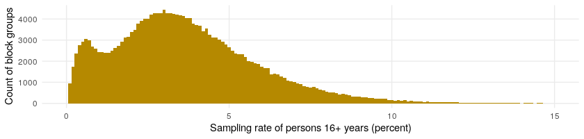

The top sub-figure shows the histogram, and the bottom shows the empirical cumulative distribution function. We can see in the empirical cumulative distribution, for example, that at 7.5% along the x-axis the yellow line crosses the y-axis just shy of 1.00, which is also known approximately as the 99th percentile. This tells us that virtually all the block groups, or 99% of them, have a sampling rate of 7.5% or less. The 75th percentile block group has a sampling rate of about 4%, meaning 75% of the block groups have a sampling rate of 4% or less.
We can look at this distribution over time by looking at an empirical cumulative distribution function week over week this year. We can see by looking at the horizonal line at 0.50 the median (or 50th percentile) block group has sampling rates between 2% and 3.5% of the population. The 10th percentile of block groups with the lowest sampling rates varies between 0.5% and 1% weekly, and the 90th percentile of block groups with the highest sampling rates varies between 4% and 6.5% weekly.

Criteria for Panel Selection
Let’s dive deeper into the characteristics of location data sourced passively from mobile devices so we understand the motivation for the criteria we selected for the panel. Namely, passively collected mobile device data suffer from inconsistent sampling through time and biases associated with geographic and demographic characteristics.
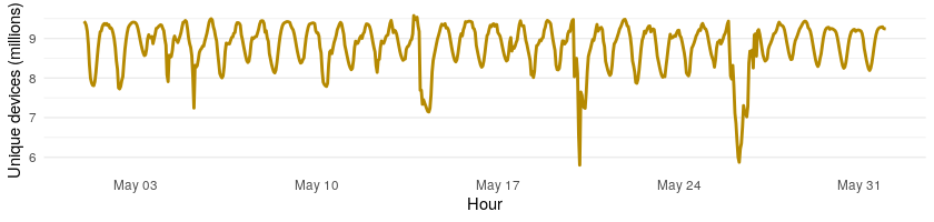
To understand inconsistent sampling, it is important to talk about the source of the location data, mobile applications using GPS positioning to provide location-based services. Since the usage of the applications that create locations varies hour by hour throughout the day (highest usage of locations services when people are not at home) as well as seasonally and even by location (urban vs. suburban vs. rural), the amount of data received oscillates all the time. If only looking at device locations as a sample, the results would be more a reflection of device activity than population activity. The following graphic shows how national sampling varied in May of 2021 by hour as an example.
Now let us consider bias of passively collected location data. Not all segments of the population have the same usage of their mobile devices and location-based services. There are differences across area types and demographic groups. In 2021, 85% of the population uses smart phones according to PEW Research. This varies slightly by area type with 89% in urban, 84% in suburban, and 80% in rural areas. It varies by age with 95% of those aged 18-29 years using smart phones and 61% of those aged 65 years or more using smart phones. It also varies by income with 96% of those making $75,000 or more and 76% of those making $30,000 or less using smart phones. It is more consistent across gender and race.
Our panel of devices is key for correcting for inconsistent sampling and biases. Our solution is to focus on a subset of active devices. The panels are selected to minimize bias and promote stability throughout a week, resulting in stable insights on the full population day to day, week over week, and year over year regardless of the fluctuations in the feeds of mobile location data we use. Additionally focusing only on a panel from which to build intelligence means we have more meaningful information about each device in the panel and allows us to better understand the whole population as one does with a weighted survey.
Effectiveness of the Panel
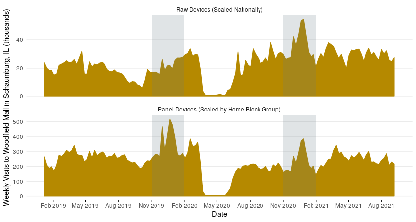
Let us look at an example where we use our panel of devices to estimate the number of visits longer than 15 minutes to Woodfield Mall in Schaumburg, Illinois. Below November, December, and January are highlighted for the two winters in this timeframe. These months are peak shopping season at a mall, and we expect that due to COVID-19 the winter 2019-2020 visits will be higher than in the 2020-2021 winter. We can see that scaling all raw devices directly (top sub-figure) does not capture this reality, and that the panel approach does (bottom sub-figure). This is because the number of raw devices in the Chicago area in the later part of the timeline increased as compared to 2019 due to fluctuations in data feeds.
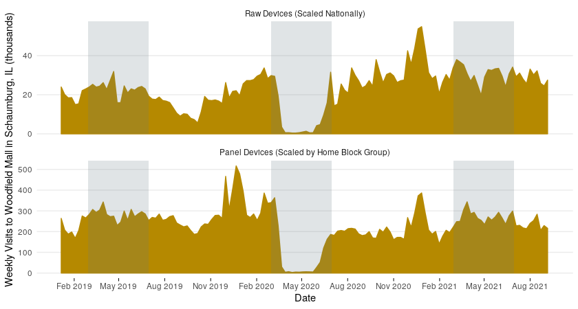
Focusing in on March through June in the next figure, we can really see how the panel approach produces a consistent estimate year over year despite data feed fluctuations by comparing 2019 and 2021. We also see that this approach still captures true shifts in number of visits by looking at 2020 during the lockdowns related to COVID-19. Additionally, the increase just after June 2020 in the panel devices is more reasonable as compared to the raw devices in the context of a cautious pandemic summer. It shows that the panel is sensitive to person movement rather than just increases in device pings.
In the next few posts in this series, we will introduce our Person Itineraries that are built from our panel and compare them to the NHTS.